Computer lab, Bioinformatics: Omics data analysis
Perry Moerland
Tuesday, February 23, 2021
In these computer exercises you will mainly use the statistical software package R. Since we will focus on the interpretation of the results, no previous exposure to R is required. If you want to learn more about R, see our biannual AMC Graduate School course Computing in R.
The goal of this computer lab is to give you an overview of the techniques typically applied when analyzing omics data:
- Unsupervised methods: clustering
- Quality control and normalization
- Differential expression analysis: statistical tests, multiple testing
First download the Rmd (Rmarkdown) file and open it in RStudio (Alle programma’s - R - RStudio, and ‘Ignore Update’). If you didn’t do so yet, first install the different packages that we’ll need. In order to execute R code from within RStudio, just click the green arrow head in the chunk of code shown below or put the cursor somewhere in the chunk and select Run - Run Current Chunk from the menu. You can also execute code line-by-line using Ctrl-Enter:
# If you didn't do so yet, first install the required packages. The commented line
# is needed for the L0 desktops, but can be skipped on other systems
#.libPaths("C:/Scratch")
# Installation of packages might take a few minutes
# If in the console you are asked "Update all/some/none? [a/s/n]:". Just reply "n"
install.packages("BiocManager")
BiocManager::install(c("affy","arrayQualityMetrics","bioDist","genefilter","GenomeInfoDbData",
                       "hgu133acdf","limma","tibble","mclust","ClassDiscovery"))
Now load the libraries so that you can use the functions defined in them:
library(affy)
library(arrayQualityMetrics)
library(bioDist)
library(ClassDiscovery)
library(genefilter)
library(limma)
library(mclust)
1 Unsupervised methods
Unsupervised learning methods aim at detecting structures in data. The term unsupervised refers to the fact that these methods do not use gene or sample annotations, only the (normalized) gene expression values are used. A primary purpose of such methods is to group similar data together (clustering) and provide a visualization of the data in which structures can easily be recognized. These may be relations among genes, among samples, or even between genes and samples. The discovery of such structures can lead to the development of new hypotheses, e.g., the grouping of genes with similar expression profiles may indicate that they are co-regulated and are possibly involved in the same biological process. If one looks at samples instead of genes, the separation of expression profiles of patient tissue samples may point to a possible refinement of disease taxonomy. On the other hand, unsupervised methods are often used to confirm known differences between genes or samples. If a clustering algorithm groups samples from two different tumor types into distinct clusters, this provides evidence that the tumor types indeed show clearly detectable differences in their global expression profiles.
As you might have noticed, in the above the word similar was used several times. This is really a central concept in unsupervised learning be it clustering or visualization. In clustering one wants to group similar objects together, whereas in visualization one wants to find a representation of a high-dimensional data set in two or three dimensions while loosing as little information as possible: objects that are similar in the original data space should also be similar in the low-dimensional space.
Assume that we performed a mini-experiment with four samples (A,B,C,D) and four genes per sample. The resulting data set has been checked for low-quality samples and has been properly normalized. The resulting log-ratios are given in file hcexample.txt. Download this file and save it in the same folder as the current Rmd file.
The following piece of R code reads in hcexample.txt and then plots the sample profiles:
E <- read.table("hcexample.txt")
matplot(E,type="l",col=1:4,lty=1:4,lwd=3,xlab="Gene",ylab="log2-ratio",xaxt="n")
axis(1,1:4)
legend(3.3,2.8,c("A","B","C","D"),lty=1:4,col=1:4,lwd=3,y.intersp=1,cex=1.3)
Cluster algorithms group similar data together. What is meant by the word similar is formally defined by the notion of a distance. In R, the bioDist package gives a collection of functions for calculating distance measures. We will have a look at two of them in more detail.
Calculate the Euclidean (euc) and the Pearson sample correlation (cor.dist) distance between the sample profiles.
# Note that you have to transpose (t) the data matrix E since pairwise distances
# are calculated for rows of a matrix
d.euc <- euc(t(E))
d.euc
# A B C
# B 2.00000
# C 10.00000 10.19804
# D 10.19804 10.00000 2.00000d.cor <- cor.dist(t(E),abs=FALSE)
d.cor# A B C
# B 2
# C 0 2
# D 2 0 2Note that you can always obtain a detailed explanation of a function by typing ? followed by the name of the function in the Console window, for example ?euc or ?cor.dist.
Question 1 Can you explain the resulting distance matrix when using the Pearson correlation distance?
Such a distance or dissimilarity matrix forms the basis for most clustering algorithms. In omics literature, an agglomerative (i.e., bottum-up) hierarchical approach such as implemented in the hclust function is popular. As explained in the lecture, hierarchical clustering tries to find a tree-like representation of the data in which clusters have subclusters, which have subclusters, and so on. The number of clusters depends on in how much detail one looks at the tree. Hierarchical clustering uses two types of distances:
- Distance between two individual data points (Euclidean, correlation etc. )
- Distance between two clusters of data points, also called linkage (single, average, etc.).
Question 2 Draw (just with pencil on paper) the dendrograms for both the Euclidean and the correlation distance matrix generated above. Explain your results.
# First specify that the two plots should be made on the same row
par(mfrow=c(1,2))
hc.euc <- hclust(d.euc, method="average");
plot(hc.euc,main="Dendrogram (Euclidean)",sub="Average linkage",hang=-1);
hc.cor <- hclust(d.cor, method="average");
plot(hc.cor,main="Dendrogram (Correlation)",sub="Average linkage",hang=-1);
par(mfrow=c(1,1))
One property of most clustering algorithms is that they always produce clusters. This happens regardless of whether there is actually any meaningful clustering structure present in the data. Let us now simulate some unstructured data (rnorm randomly generates data from a normal distribution) and see what happens.
# 1000 genes
n.genes <- 1000
# 50 samples
n.samples <- 50
# Generate labels for the samples
descr <- paste("S", rep(c("0",""),times=c(9,41)), 1:50, sep="")
# Fix the random seed to make the exercise reproducible
set.seed(13)
# Matrix of expression data for 1000 genes and 50 samples
dataMatrix <- matrix(rnorm(n.genes*n.samples),nrow=n.genes)
Question 3 Use hclust with Euclidean distance and average, single, and complete linkage to cluster the samples and plot the resulting dendrograms. First have a look at ?hclust and especially the examples at the bottom of the help page to see how to use this function. If this goes beyond your current R skills, have a look at the answers and just run the code given there.
# First specify that the three plots should be made on the same row
par(mfrow=c(1,3))
# The following code generates the three dendrograms
dEuc <- euc(t(dataMatrix))
hAvgEuc <-hclust(dEuc, method="average")
plot(hAvgEuc, labels=descr,cex=0.6)

hSinEuc <-hclust(dEuc, method="single")
plot(hSinEuc, labels=descr,cex=0.6)

hComEuc <-hclust(dEuc, method="complete")
plot(hComEuc, labels=descr,cex=0.6)
# Back to default
par(mfrow=c(1,1))
Question 4 Which phenomenon do you see with single linkage? How might this make interpretation difficult?
Question 5 The complete linkage dendrogram seems to show some structure in the data and you might decide that four clusters can be discerned. Is this structure real?

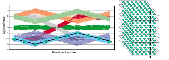
This figure shows the gene profiles of another synthetic data set which is slightly closer to biological reality. The black line in the left-hand figure depicts one single gene expression profile and the vertical black line in the right-hand figure illustrates how the black gene expression profile is constructed: the gene expression levels of the same spot (=gene) over multiple microarray experiments are taken. Only ten arrays are considered in this simulated dataset. Therefore, the left-hand figure has ten experiments on the x-axis. The data set consists of nine different profiles; round each profile 50 noisy profiles were generated. Therefore, each simulated array contains 9*(50+1)=459 different profiles. The log-ratio of these gene profiles is indicated on the y-axis.
Download the corresponding data file jq.txt and save it in the same folder as the current Rmd file.
Question 6 When clustering the genes with the Euclidean distance, how many clusters would you expect?
jq.data <- read.table("jq.txt")
heatmap(as.matrix(jq.data),Colv=NA,scale="none",labRow=NA,col=blueyellow(64))
Question 7 Which values can the argument scale of the function heatmap take (hint: ?heatmap)? Explore the influence of the argument scale. Can you explain the heatmap obtained with scale="row"?
scale can take the values “none”, “column” and “row”. With scale="row" the expression values are centered (to mean zero) and scaled (to standard deviation one) the row direction. The structure of the dendrogram is identical to the one in the previous heatmap. The argument scale only affects the visualization of the values. An unwanted side effect can be observed in the topmost cluster. This corresponds to a group of genes with comparable expression values, but scaling inflates their variability and less clearly illustrates the underlying structure of the data.
heatmap(as.matrix(jq.data),Colv=NA,scale="row",labRow=NA,col=blueyellow(64))
Until now we determined the number of clusters ‘by eye’. There are many methods to choose the optimal number of clusters for a given clustering solution. A simple graphical procedure is to plot the heights of the branches of a dendrogram:
# Plot the height of the 20 branches closest to the root of the tree
plot(rev(hclust(euc(as.matrix(jq.data)))$height)[1:20],
     main="height of the branches of the dendrogram",type="l",ylab="height")
Question 8 How can you use this curve to determine the number of clusters?
dataMatrix generated earlier, one would expect a gradually decreasing curve without a clear hinge point, which is indeed the case.
# Plot the height of all branches
plot(rev(hclust(euc(t(dataMatrix)),method="complete")$height),
     main="height of the branches of the dendrogram",type="l",ylab="height")
2 Quality control
Let us now have a look at a real microarray dataset. We are going to analyze data from a human patient study comparing the transcriptome of women with preeclampsia (n = 12; 24-36 wk) vs. samples from women who delivered due to preterm labor with no evidence of infection (n=11; 24-36 wk) (Winn et al., 2009) The study was performed using the HG-U133A&B Affymetrix GeneChip platform and data is publicly available from the GEO Expression Omnibus (GEO) with accession number GSE14722. Have a look at the GSE record and also at one of the GSM records, for example GSM367781.
We will start with retrieving the raw Affymetrix data as stored in the CEL files for the HG-U133A chips. This can be done as follows (might take a few minutes, depending on your internet connection; time for coffee!).
# Download raw data from GEO
# Normally this can be done via the lines of code that are commented out, but
# this option is sometimes blocked. Therefore we download both files 'manually'.
#library(GEOquery)
#getGEOSuppFiles("GSE14722")
# The CEL files are downloaded and stored in folder GSE14722 as a tar archive
dir.create("GSE14722")
setwd("GSE14722/")
if (!file.exists("GSE14722_RAW.tar")){
  download.file("ftp://ftp.ncbi.nlm.nih.gov/geo/series/GSE14nnn/GSE14722/suppl/GSE14722_RAW.tar",
              destfile="GSE14722_RAW.tar",mode="wb")
  download.file("ftp://ftp.ncbi.nlm.nih.gov/geo/series/GSE14nnn/GSE14722/suppl/filelist.txt",
              destfile="filelist.txt")
}
# If the next line gives an error (GSM367781.CEL.gz: Can't create ...) use the Windows program 7-Zip
# with 'Uitpakken (hier)'
untar("GSE14722_RAW.tar")

# Read in the gzipped CEL files for the 23 HG-U133A chips
tab <- read.delim("filelist.txt")
affybatch <- ReadAffy(filenames=as.character(tab[2:24,"Name"]))
# Add sample annotation, in this case 'by hand' so to speak
pData(affybatch) <- data.frame(condition=c(rep("preterm",11),rep("preeclampsia",12)),
                               pData(affybatch))
# You might want to verify the sample annotation with the information available
# at GEO to be sure that we did not make any mistake
pData(affybatch)
# condition sample
# GSM367781.CEL.gz preterm 1
# GSM367782.CEL.gz preterm 2
# GSM367783.CEL.gz preterm 3
# GSM367784.CEL.gz preterm 4
# GSM367785.CEL.gz preterm 5
# GSM367786.CEL.gz preterm 6
# GSM367787.CEL.gz preterm 7
# GSM367788.CEL.gz preterm 8
# GSM367789.CEL.gz preterm 9
# GSM367790.CEL.gz preterm 10
# GSM367791.CEL.gz preterm 11
# GSM367792.CEL.gz preeclampsia 12
# GSM367793.CEL.gz preeclampsia 13
# GSM367794.CEL.gz preeclampsia 14
# GSM367795.CEL.gz preeclampsia 15
# GSM367796.CEL.gz preeclampsia 16
# GSM367797.CEL.gz preeclampsia 17
# GSM367798.CEL.gz preeclampsia 18
# GSM367799.CEL.gz preeclampsia 19
# GSM367800.CEL.gz preeclampsia 20
# GSM367801.CEL.gz preeclampsia 21
# GSM367802.CEL.gz preeclampsia 22
# GSM367803.CEL.gz preeclampsia 23setwd("..")The affybatch object contains the measured intensity for each of the probes on each array:
affybatch# # AffyBatch object
# size of arrays=712x712 features (27 kb)
# cdf=HG-U133A (22283 affyids)
# number of samples=23
# number of genes=22283
# annotation=hgu133a
# notes=Question 9 Can you explain why on each array there are far more features (probes) than genes?
Quality control (QC) is crucial for any scientific method producing data and microarrays are no exception. We will now investigate some QC pipelines for (Affymetrix) microarrays in more detail.
The arrayQualityMetrics package produces, through a single function call, a comprehensive HTML report of quality metrics about a microarray dataset. The aim of the arrayQualityMetrics package is to produce information that is relevant for your decision making - not, to make the decision. It will often be applied to two, somewhat distinct, use cases:
- Assessing quality of a raw dataset, in order to get feedback on the experimental procedures that produced the data;
- Assessing quality of a normalised dataset, in order to decide whether and how to use the dataset (or subsets of arrays in it) for subsequent data analysis.
Let us apply arrayQualityMetrics to our raw Affymetrix data (might take some time …):
## do.logtransform: data still has to be log-transformed
## intgroup: add 'condition' (preeclampsia/preterm) as a factor of interest
if (!dir.exists("aQ_raw")){
  arrayQualityMetrics(affybatch,outdir="aQ_raw",do.logtransform=TRUE,spatial=FALSE,
                    intgroup="condition",force=TRUE)
}
When the function arrayQualityMetrics is finished, a report is produced in the directory specified by the function’s outdir argument. You can also download the zipped directory and unzip it. The resulting directory contains an HTML page index.html that can be opened by a browser. The report contains a series of plots explained by text. Some of the plots are interactive. Technically, this is achieved by the use of SVG (scalable vector graphics) and JavaScript, and it requires that you use a recent (HTML5 capable) web browser. In the case of AffyBatch input, some Affymetrix specific sections are added to the standard report.
Question 10 Which arrays are detected as outliers and based on which criteria?
Question 11 Figure 12 in the arrayQualityMetrics report shows an RNA degredation plot. As you can see, the measured intensity is higher at the 3’-end than at the 5’-end. Can you explain this effect?
Several other R packages have been developed for QC of Affymetrix arrays. These were conveniently wrapped into the web server Arrayanalysis.org (Eijssen et al., 2013) before Maastricht University got hacked (seriously, no kidding!). Via the ‘Get started’ tab of Arrayanalysis.org I submitted a zip file of the 23 CEL files and ~15 minutes I received a mail with a detailed QC report. Investigate the report in more detail.
Question 12 Do the results of the Arrayanalysis.org report confirm those obtained with arrayQualityMetrics?
You might wonder whether these between-array differences can be corrected for by normalization. Let us normalize the raw data using RMA and then generate an arrayQualityMetrics report for the normalized data:
# Normalization using RMA
eset <- rma(affybatch)
# Background correcting
# Normalizing
# Calculating Expressionif (!dir.exists("aQ_norm")){
arrayQualityMetrics(eset,outdir="aQ_norm",intgroup="condition",
force=TRUE)
}Question 13 Open the file index.html in the folder aQ_norm. Are the arrays 2, 6, 13 and 20 also outliers according to this report?
Question 14 Finding the technical reasons for such systematic differences between arrays often requires some detective work. Here, the table ‘Array metadata and outlier detection overview’ in the arrayQualityMetrics provides a clue. Can you find a likely explanation for the fact that arrays 2, 6, 13 and 20 were detected as outliers?
This begs the question whether also for the other dates less pronounced batch effects can be observed. For this purpose we regenerate an arrayQualityMetrics report but now including information about the scan dates throughout:
# Create a vector of scandates
pData(eset)$scandate <- sapply(protocolData(eset)$ScanDate,function(x) strsplit(x," ")[[1]][1])
pData(eset)$scandate
# [1] "02/11/05" "02/26/04" "11/10/04" "02/11/05" "08/25/04" "02/26/04"
# [7] "03/10/05" "03/10/05" "02/11/05" "11/10/04" "11/10/04" "11/10/04"
# [13] "02/26/04" "02/11/05" "11/10/04" "11/10/04" "11/10/04" "08/25/04"
# [19] "11/10/04" "02/26/04" "03/10/05" "02/11/05" "02/11/05"if (!dir.exists("aQ_norm_batch")){
arrayQualityMetrics(eset,outdir="aQ_norm_batch",intgroup=c("scandate","condition"),
force=TRUE)
}The PCA plot (Figure 3) clearly shows that differences between batches (for which the scan dates are a proxy) are the main drivers of differences in gene expression, more so than the clinically relevant difference between preeclampsia and preterm samples. Note that the investigators at least took care to have more or less equal numbers of preeclampia and preterm samples for each scan date, which means that batch and ‘clinical’ effects are not confounded.
3 Differential expression
Question 15 What would the effect of the observed batch effects on determining which genes are differentially expressed between preeclampsia and preterm samples?
For data that is available at GEO, an easy initial differential expression analysis can be performed using GEO2R. Go to GSE14722 and click on ‘Analyze with GEO2R’ at the bottom of the page.
- Select GPL96 which corresponds to the HG-U133A chip.
- Click ‘Define groups’ and enter names for the groups of Samples you plan to compare, e.g., preeclampsia and preterm.
- Assign Samples to each group. Highlight Sample rows then click the group name to assign those Samples to the group. Use the Sample metadata (title, source and condition) columns to help determine which Samples belong to which group.
- Click ‘Top 250’ to perform the calculation with default settings.
- Results are presented as a table of genes ordered by significance. The top 250 genes are presented and may be viewed as profile graphs. Alternatively, the complete results table may be saved.
Question 16 How many probesets are differentially expressed with an adjusted p-value <0.05?
Of course, you can do a very similar analysis directly in R. First, we will perform a two-sample t-test as a simple way of identifying genes that are differentially expressed. We use the function rowttests to perform row-by-row (=gene-by-gene) tests for a significant difference in mean expression between the preeclampsia and preterm samples.
# exprs(eset): extracts the expression values
tt <- rowttests(exprs(eset),as.factor(pData(eset)$condition))
# Inspect the first rows of the matrix tt
head(tt)
# statistic dm p.value
# 1007_s_at 4.6257518 0.441970077 0.0001456704
# 1053_at 0.1943415 0.007722255 0.8477762474
# 117_at -0.4838556 -0.044590784 0.6334956740
# 121_at -0.4327096 -0.029681285 0.6696371316
# 1255_g_at 0.9359909 0.058845777 0.3599176994
# 1294_at 0.1918253 0.012752236 0.8497217758# Number of rows and columns of tt
dim(tt)# [1] 22283 3The matrix tt contains 22283 rows, one for each probeset, and three columns describing the t-statistic, difference between the means and the p-value, respectively. Take a look at the histogram of resulting p-values using the function hist:
# If you don't see a plot appearing, execute dev.off() in the console one (or more) times till you get 'null device 1'
hist(tt$p.value,breaks=50,col="orange",main="nominal p-values")
# Number of probesets with p < 0.05
sum(tt$p.value<0.05)
# [1] 1070
Apparently, 1070 probesets are differentially expressed with a p-value < 0.05.
Question 17 Is this a realistic way of determining which probesets are differentially expressed?
Here, we use the function p.adjust to either control the family-wise error rate using the Bonferroni correction or the false discovery rate with Benjamini-Hochberg:
p.bonferroni <- p.adjust(tt$p.value,"bonferroni")
sum(p.bonferroni<0.05)
# [1] 1p.fdr <- p.adjust(tt$p.value,"fdr")
hist(p.fdr,col="yellow",main="FDR corrected")
sum(p.fdr<0.05)# [1] 11
Question 18 Explain why using the false discovery rate more probesets have an adjusted p-value < 0.05 than when using a Bonferroni correction (11 versus 1, respectively).
David Robinson wrote a nice blog post on the interpretation of of (unadjusted!) p-value histograms.
Next time, we’ll continue with the analysis of this dataset. We’ll take batch effects into account and see what we gain from it, and we’ll perform some pathway analyses.